Scoop
Cornell AppDev
Product Designer
Overview
Designed MVP of Scoop, a rideshare platform for Cornell students
My Role
Product Designer
Timeline
February 2022 - April 2023
Team
1 Product Manager, 2 Product Designers, 7 Developers, 1 Product Marketer
Skills / Tools
Figma, Product Thinking, Interaction Design, Visual Design
⟡ Background
What is Scoop?
⟡ The Problem
Can someone give me a ride?
Located in upstate New York, it is not easy for Cornell students to travel to and from their desired destinations. Cornell students want reliable, affordable and safe ways to travel to and from places within driving distance of Ithaca. Currently, students struggle to find options that fit their needs because:
- Travelers lack convenient and affordable travel options. Many students don't have cars on campus, and buses tend to arrive at inconvenient times and in unideal locations.
- Many students don't feel safe using existing rideshare groups due to a lack of trust.
⟡ The Solution
Scoop: not an ice cream app
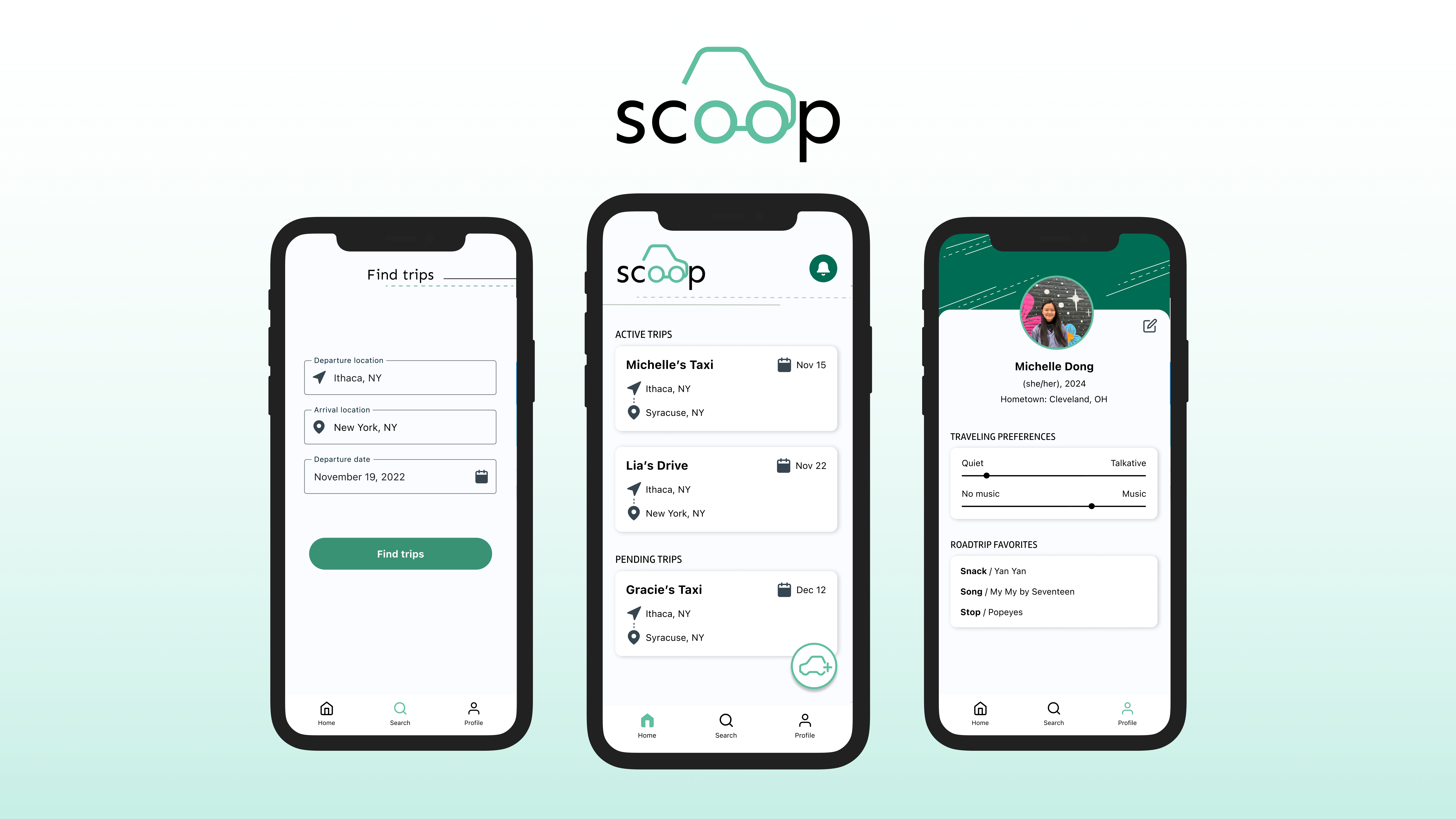
As part of Cornell AppDev, a student-run project team, we created Scoop: a more affordable and safe way to travel to and from campus. Over the course of two semesters, my team and I designed the MVP of Scoop. We launched Scooped for iOS in spring 2023.
Onboarding
Users input basic profile details, their preferred contact method, and roadtrip preferences and favorites to get to know other travelers!
Post a new trip
Users can easily create a new trip and review trip details before posting.
Find Trips
Users can quickly find a trip based on their desired locations and departure dates, as well as filter by trip type.
⟡ The process
User research, aka pre-trip planning
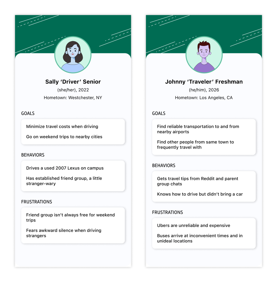
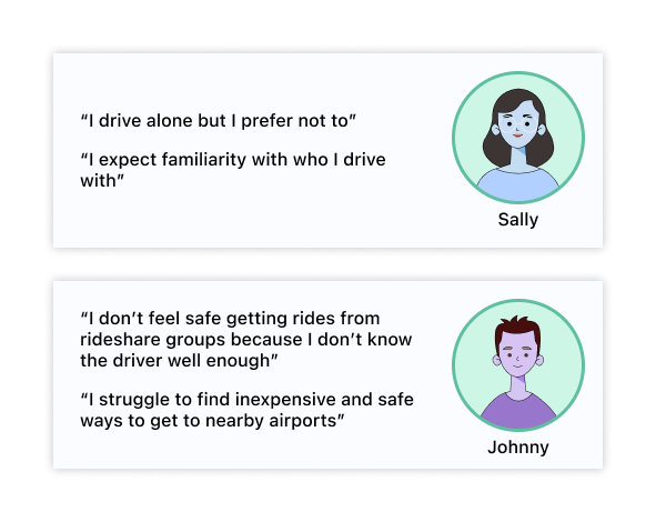
Before I joined, Lia (product manager and co-designer) interviewed four drivers and three non-drivers (travelers), conducted market research, and lead a competitor analysis to better understand why existing solutions were failing to meet user needs. We created two personas to represent the core users.
The main findings were:
- 3 out of 5 students end up driving long distances out of Ithaca alone, even thought they would rather not drive such long distances alone
- 70% of people expect to know the person they are getting in a car with in some capacity.
Establishing safety and trust
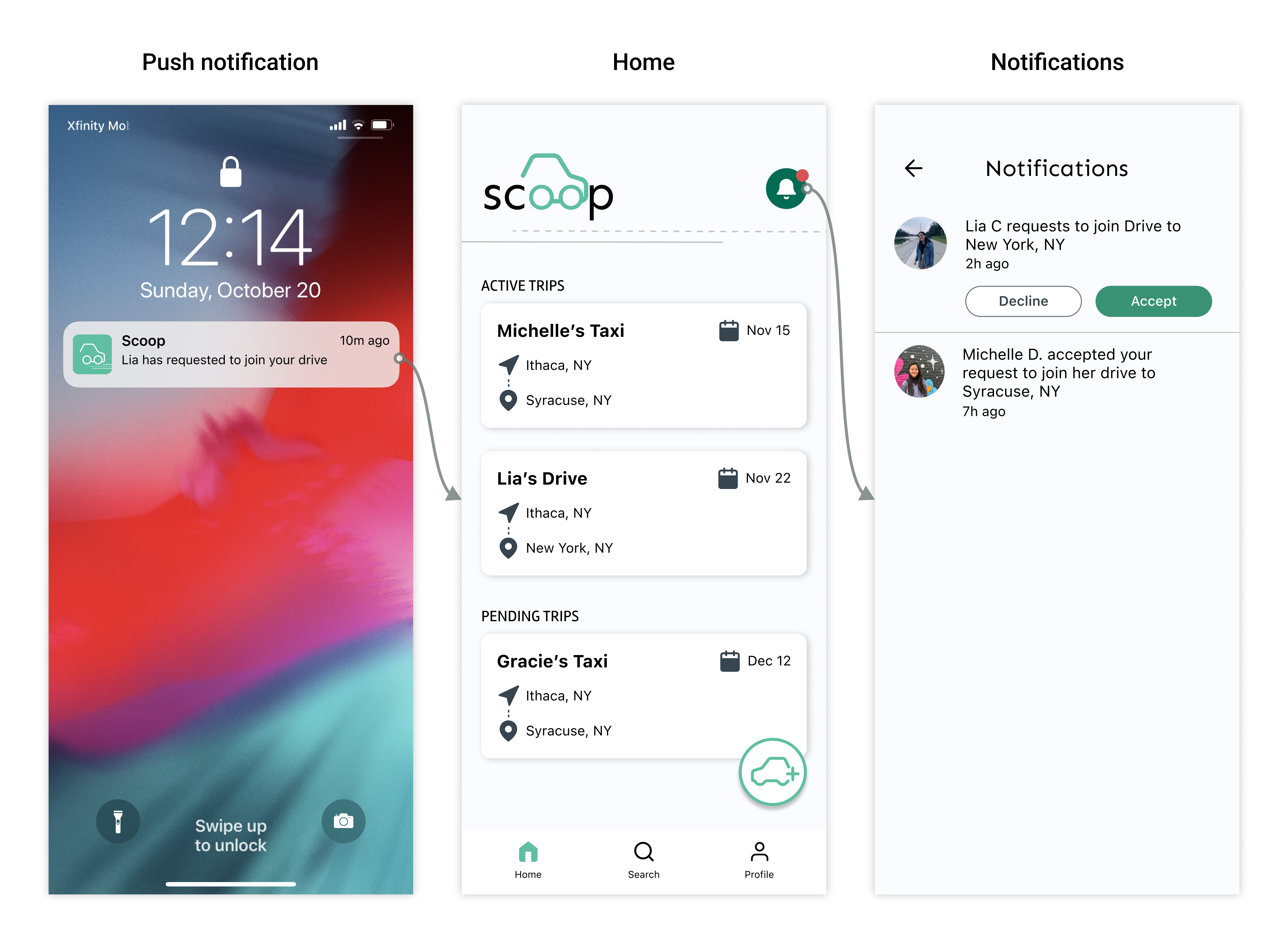
Based on these findings, we determined that the solution must establish a sense of safety and trust. To achieve this, we decided to limit the users of this app to only Cornell students by requiring users to log in with their Cornell email. User profiles provide students with more details about who they are traveling with. In addition, trip creators can accept or decline requests from other travelers to join a trip.
Working around our trip's budget
A technical and financial limitation we faced as a team of student app developers was in-app communication, which would be difficult to build and expensive to maintain. As such, we decided to have the primary communication between travelers occur off the app, and instead share the contact information (email or phone number, depending on their preferences) of the trip to users who request to join a ride.
In addition, in an early iteration of the MVP, we designed the trip preview to include a map from the departure location to the arrival location. Implementing the mapkit was a larger task than anticipated, so we ended up removing the map preview in the revised MVP.
MVP trip itinerary
For the MVP, Scoop has three main pages. On the home page, users can view the active trips they are part of (as either a driver or a traveler) and their pending trips, as well as post a new trip. Users can also find and join trips posted by other Cornell students that match their departure date and departure and arrival locations. On the profile page, users can share their travel preferences and road trip favorites.
⟡ Design Decisions
1. Home feed explorations
Users with upcoming trips want to be able to quickly create new trips and see details about the trips they’ve created and joined.
Option B was chosen because the custom icon gave more visual context about posting a new trip than option A. While option C had the clearest call to action, the carousel of ride cards resulted in a lack of space to display trip details. Option B helps users to achieve their goal in the most efficient manner, since most of the trip details would already be displayed on the home page.
2. Card explorations
Based on our decision for the home layout, we wanted a rectangular card to display the trip details.
We chose Option A because it was easy to view the main trip details without overwhelming the user. The trip title helps differentiate rides going to the same destination on the same date. Option A’s vertical layout accommodates for longer location names, unlike option B. The additional information in option B would be displayed on the trip details screen after they tap on the card.
3. Search explorations
We explored different ways for users to find trips that matched their needs. We wanted this entry point to prioritize searching for rides when users have a specific destination in mind, rather than generally browsing for a potential trip they could join.
Option A paces the user through each field on a different screen while option B shows all the information necessary on one screen. We chose to go in the direction of Option B since users could quickly see what information they needed to provide. We iterated on option B and ended up using Option B’, which includes only the most important fields to make it easy for users to find a trip. We decided to move the transport method so that users could filter their search results.
4. Search results explorations
Since only Cornell students can create trip posts, users may not always find a trip that matches their criteria. Thus, we wanted to reduce user frustration by empowering users to find similar trips.
We chose Option B because it reminds users that the best matches are based on the search summary and allows users to edit their search. While the summary utilizes significant screen space, it saves the user time from returning to the initial search screen.
⟡ Visual Design
Figuring out the trip's desired vibes
We wanted Scoop to convey safety and sustainability while emphasizing the app’s purpose. To decrease confusion about the app name, we added visual details that tie back to driving.
We experimented with a few colors and ultimately chose a welcoming, fresh green as the primary brand color of Scoop. We complemented the main green with a darker and lighter variation that passed WCAG AA accessibility guidelines to create a cohesive, trustworthy brand.
⟡ Arriving at our destination
After many months on the road, we were nearing our destination. These were the core MVP interactions for trip creators and riders:
Posting a new trip
Requesting to join a trip
Accepting a request
⟡ Reflection
What I learned
I’ve learned so much from working with a cross-functional team and working with my wonderful co-designers has made the journey of creating Scooped delightful. Designing an app from scratch taught me to:
- Iterate with purpose. It was easy to get carried away with iterating, but keeping the goal of Scoop in mind helped us stay focused and be intentional with our designs.
- Enjoy the ride! There are bound to be unexpected detours and bumps along the trip, but having a passionate team and a good playlist makes the journey all the better.
