Merlin Sound Recordings Redesign
Cornell Lab of Ornithology
User Interface Design Internship
Overview
Defined project requirements and led redesign of the Merlin Bird ID sound recordings library
My Role
User Interface Designer
Timeline
June - July 2021
Team
2 Product Designers, 1 Project Manager
Skills / Tools
Figma, Product Thinking, Market Research, Interaction Design, Prototyping
⟡ Background
What is Merlin?
Merlin Bird ID is a free mobile app that helps over a million bird enthusiasts identify birds across the world. In June 2021, Merlin launched the MVP for Sound ID, which allows users to record birds around them and view a list of potential species singing in real-time.
As a UI Design intern at the Lab of Ornithology, I led the redesign of the ‘My Sound Recordings’ experience and worked primarily with a product manager and one other designer throughout the summer remotely. The redesigned sound recordings library was released in 2022.
⟡ The Problem
How do I manage all my recordings?
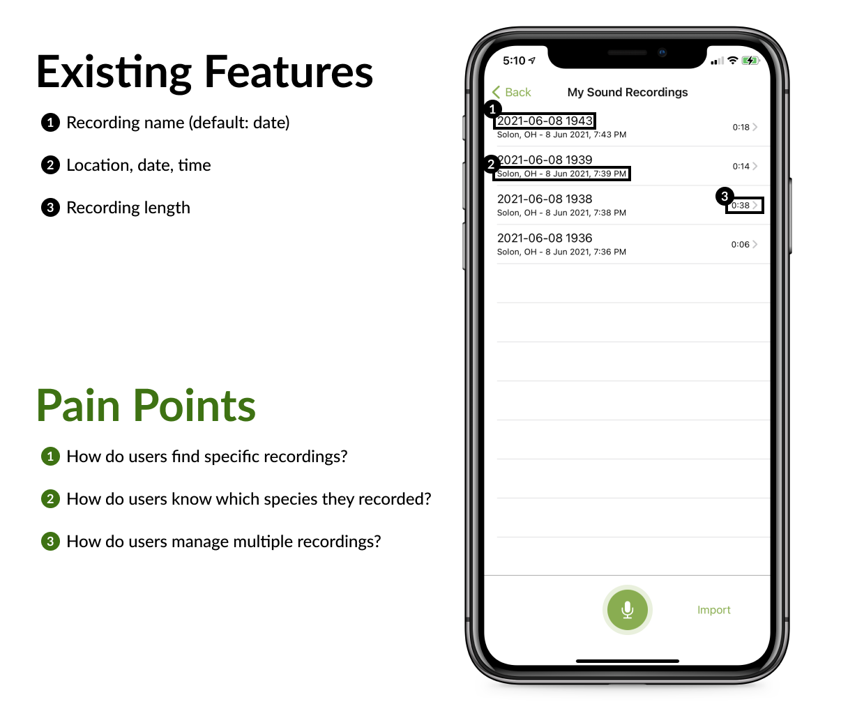
How might we improve the organization of 'My Sound Recordings’ so that users are less frustrated when navigating their recordings and feel empowered to use Sound ID more?
⟡ The Solution
A more powerful library
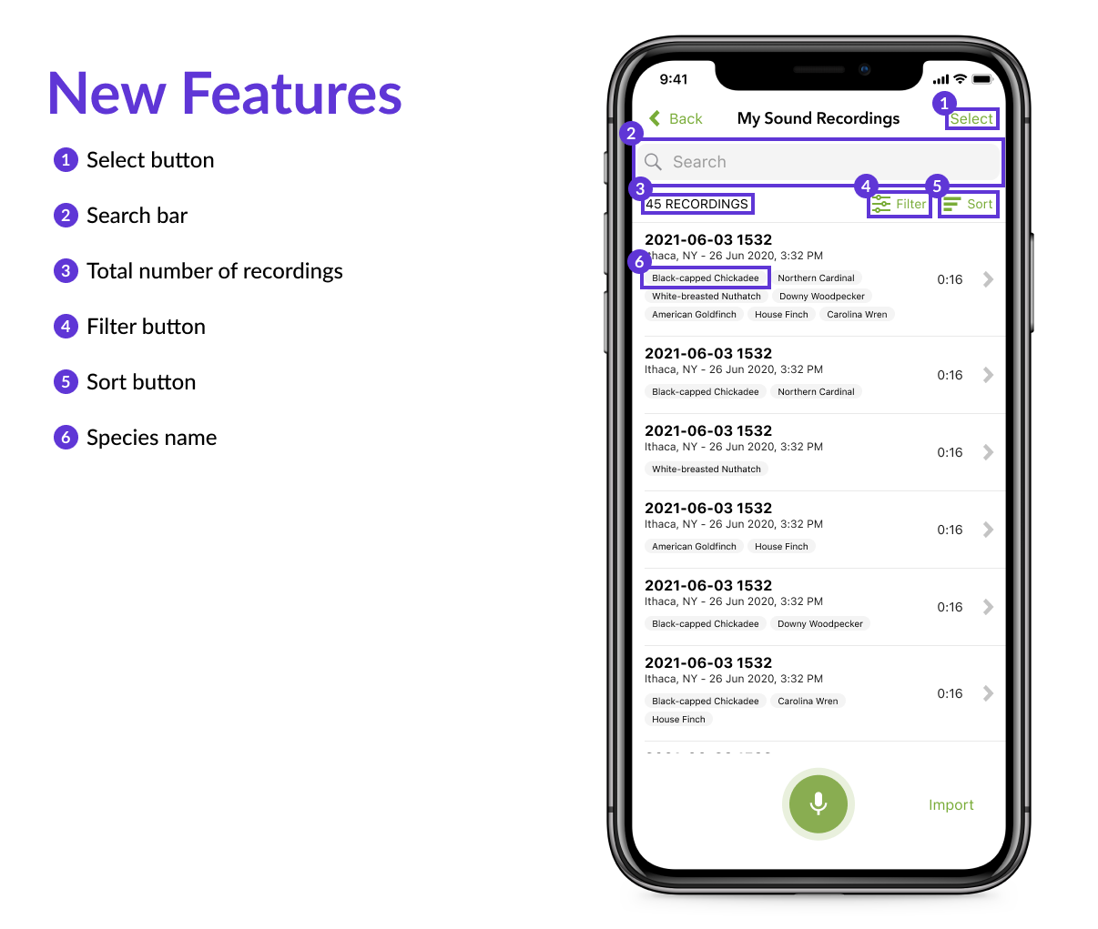
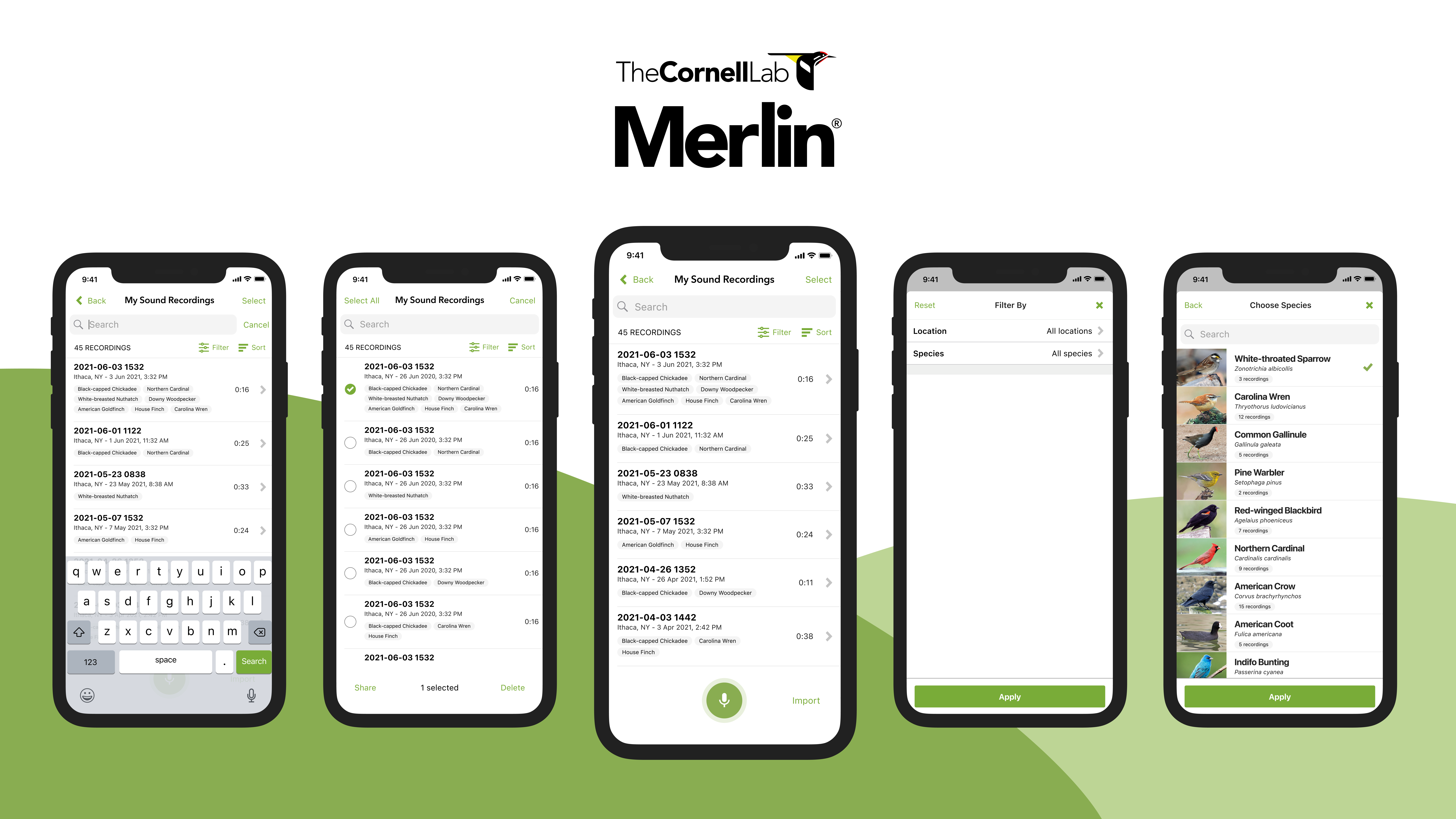
Batch select
Users can tap to select specific recordings to share or delete. The number selected is updated at the bottom of the screen. While in select mode, the user can also search, filter, and sort.
Search
Users can search by species, location, and recording name to find specific recordings. Results are updated as users type in the search bar, and the number of recordings is also updated to reflect the number of search results shown.
Filter
Users can filter their recordings by location and species. In the 'Choose Location' and 'Choose Species' modal, the most recently recorded location/species is shown at the top of the list, and users can search and select multiple locations and species to filter by.
Sort
Users can sort their recordings by file name, date recorded, and recording length.
The additional features in the redesigned 'My Sound Recordings' screen make it easier for Merlin users to manage their recordings. At the same time, there is still room in this revised design to accommodate for potential future development (adding more filters, favoriting recordings, etc.).
⟡ The Process
What do users really need?
I collaborated with the product manager to draft the project documentation in Confluence. In writing the overview, rationale, goals, measurable objectives, timeline, audience assumptions, feature requirements, I gained a new perspective on the feature development process and strengthened my product thinking skills.
The next step was to define the project requirements. We considered several user stories to help improve the organization of the 'My Sound Recordings' screen including:
- As a user, I need to find my recordings by species
- As a user, I need to find my recordings by location, date, and file name to access specific recordings
- As a user, I need to batch select recordings to share and delete multiple recordings at a time
- As a beginning birder, I need to see the image of the bird I recorded to become more familiar with different species.
- As an expert birder, I need to select multiple recordings to attach to my eBird checklist.
We focused on stories 1 to 3 for this project since we wanted to support users with many recordings by giving them more control over their library. Stories 4 and 5 were of a lower priority because they targeted specific audiences within Merlin rather than all users and wouldn’t improve the organization of the files themselves.
How do other apps organize media?
Next, I set out to understand the mental model that people had with organizing their media by analyzing five apps: Apple Voice Memos, Apple Podcasts, Apple Music, Apple Photos, and Google Photos. I found that all apps except Voice Memos had separate tabs for:
- Seeing all your files in a list or grid format
- Organizing content into folders/albums/collections
- Search
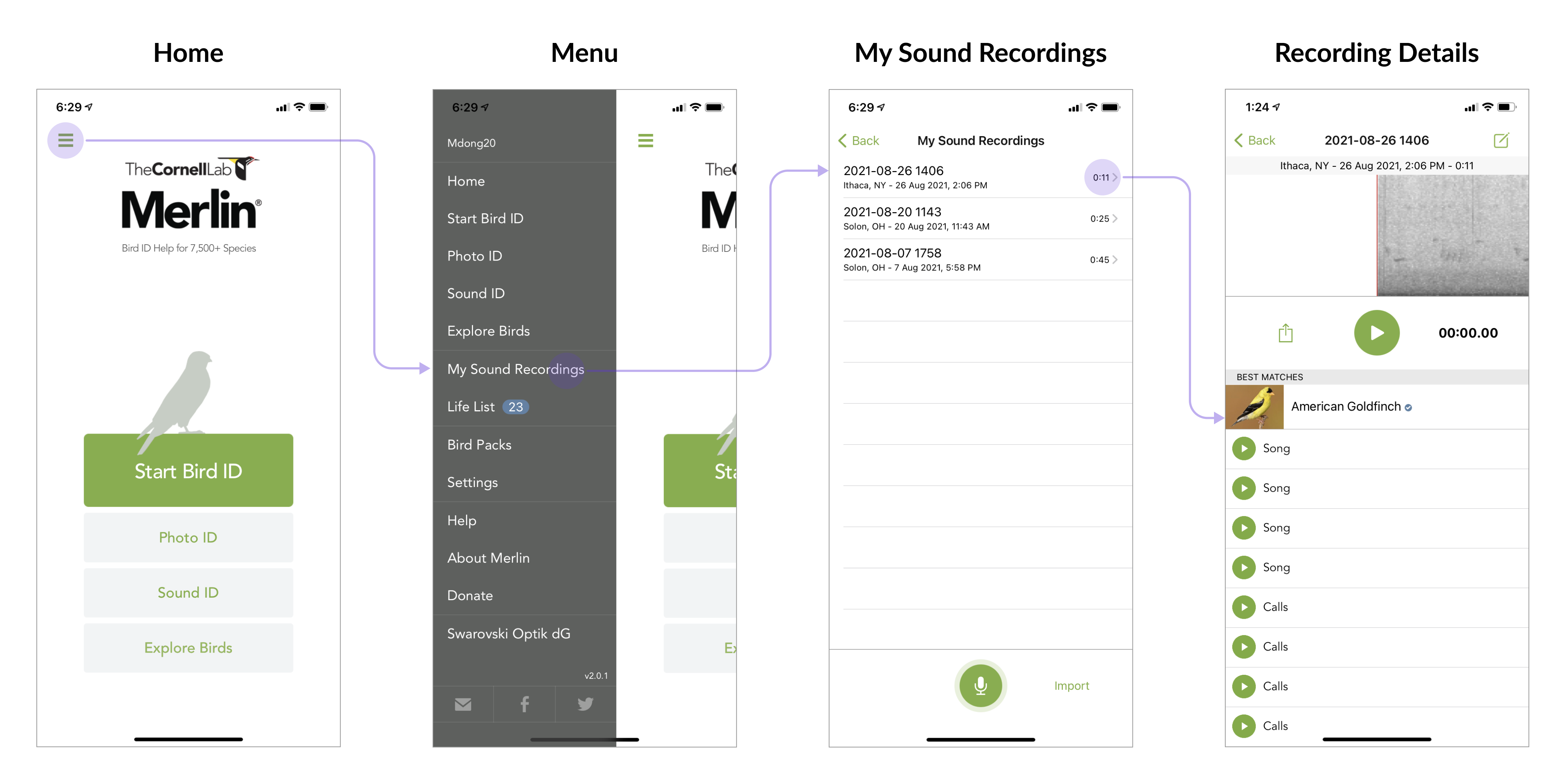
However, the current navigational structure of Merlin does not use tabs, but rather a side menu as shown below.
With this constraint, I focused on Voice Memos for its straightforward library. Users can quickly create and access new recordings; as a result, many advanced features, such as searching, favoriting, and creating folders, exist but are hidden from the main view.
⟡ Design Decisions
Since the goal of the redesigned Merlin sound recordings library was to empower users to manage their recordings, I wanted to ensure that the features added were familiar and easily visible. I designed the batch select, search, and sort flows to be intuitive and consistent by following common design patterns and using Merlin's existing design system.
1. Card explorations
To find recordings by species, I had to redesign the audio recording cards and support viewing all the species associated with each recording.
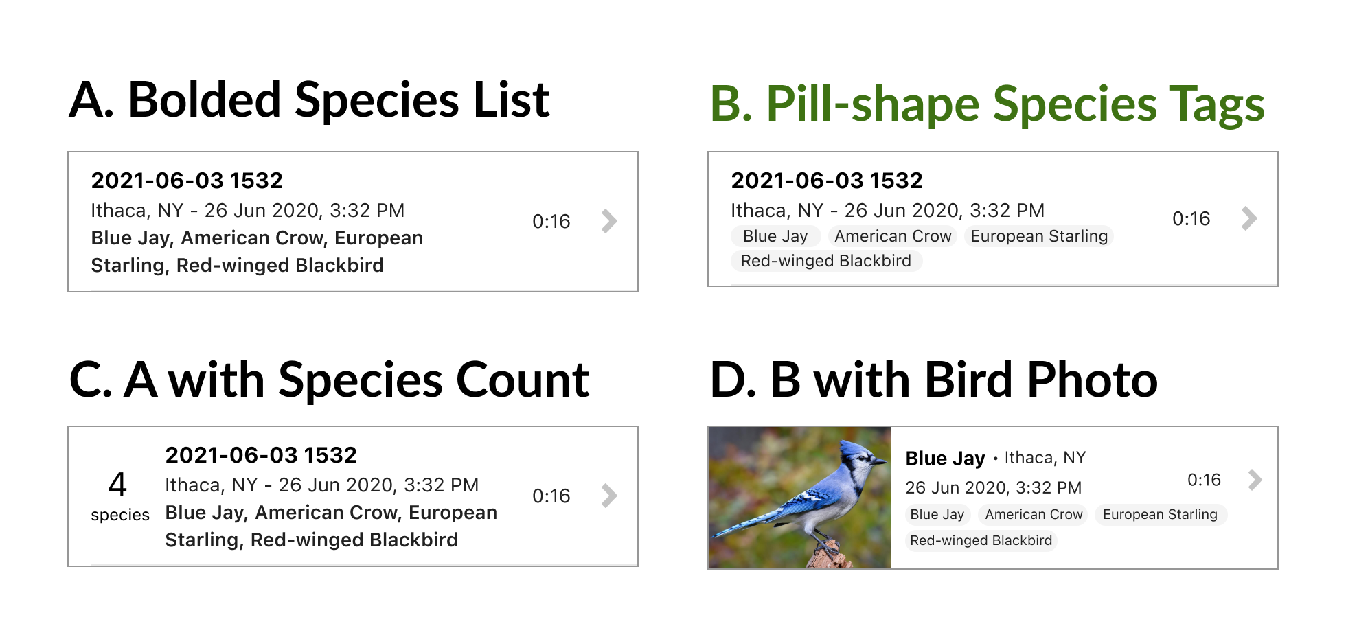
The species list in options A and C were given the same visual treatment as the file name, which caused a clash in the card's information hierarchy. Option D would be nice for beginner birders, but would emphasize only one of the birds recorded - how would we decide which bird to show? I went with Option B since it provides the most contrast for the species list and does not overwhelm the user with too much information in one card.
2. Filter explorations
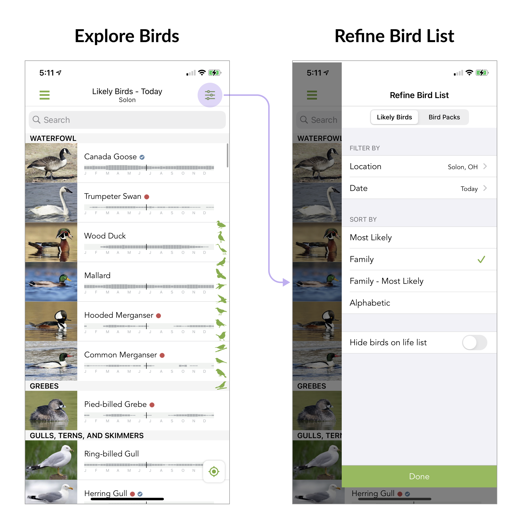
The only filter that currently exists in Merlin is in a sidebar on the 'Refine Bird List' screen that combines filter and sort, shown below.
However, I decided to use a full-screen filter modal for the sound recordings library because there was no need to see the original list of recordings while applying filters.
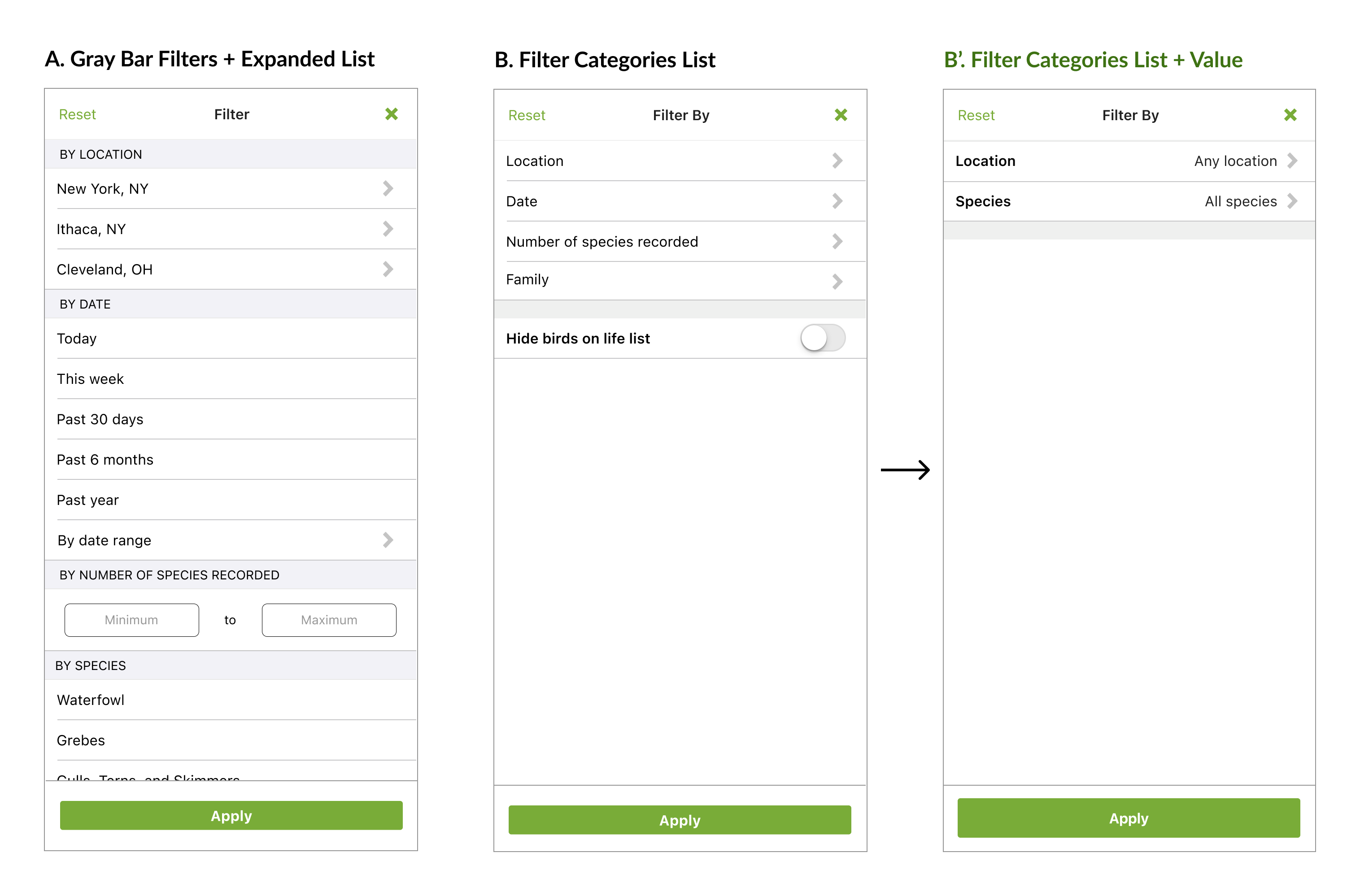
Option A takes inspiration from the gray bars used across the app, but the expanded list of filters was overwhelming and confusing since some filters led to new pages while others did not. Option B follows the filter interaction on the 'Refine Bird List' screen with the list of filter categories that lead to more specific screens once tapped. I went with Option B' after clarifying which filters were most important for this release with the project manager.
⟡ Reflection
What I learned
This project was the first time I had ever designed a new feature for a real app. I was given a lot of ownership over the project which allowed me to develop my product-thinking skills and be more confident in explaining my design decisions to developers and other groups at the Lab of Ornithology. On the technical side, I learned a lot about iOS design patterns and guidelines from material.io, the beauty of Figma components and auto layout, and documenting work for future developer handoff.
⟡ Acknowledgements
My work at the Lab of Ornithology could not have occurred without the generous support of the Kristen Rupert and John Foote Undergraduate Research Fund at the Cornell Lab of Ornithology. Special thank you to my mentor Will Morris.
